

New Look for ThankfulFor- The Series®️
An Evolved Identity

We stand as a thriving community having welcomed over 400+ guests to our last flagship event #TheBlackExcellence, and we have our eyes set on global expansion.


This growth has been organic, authentic, and driven by you, our community. As we’ve grown from a single event into a franchise of diverse experiences, we knew our visual identity needed to evolve with us. It needed to reflect the high energy, and culturally rich experiences we curate while honouring the heartfelt gratitude that remains at our core.
Today, we are proud to unveil the new look of ThankfulFor- The Series®️ and its sub-brands.

The Philosophy of Our New Look
This redesign is more than a new coat of paint; it’s a visual representation of our story. The consistent, elegant script you see across all our new logos is a deliberate nod to each seasonal origins representing the personal, human touch at the heart of our brand. While our stages get bigger, our mission to foster genuine connection remains the same.
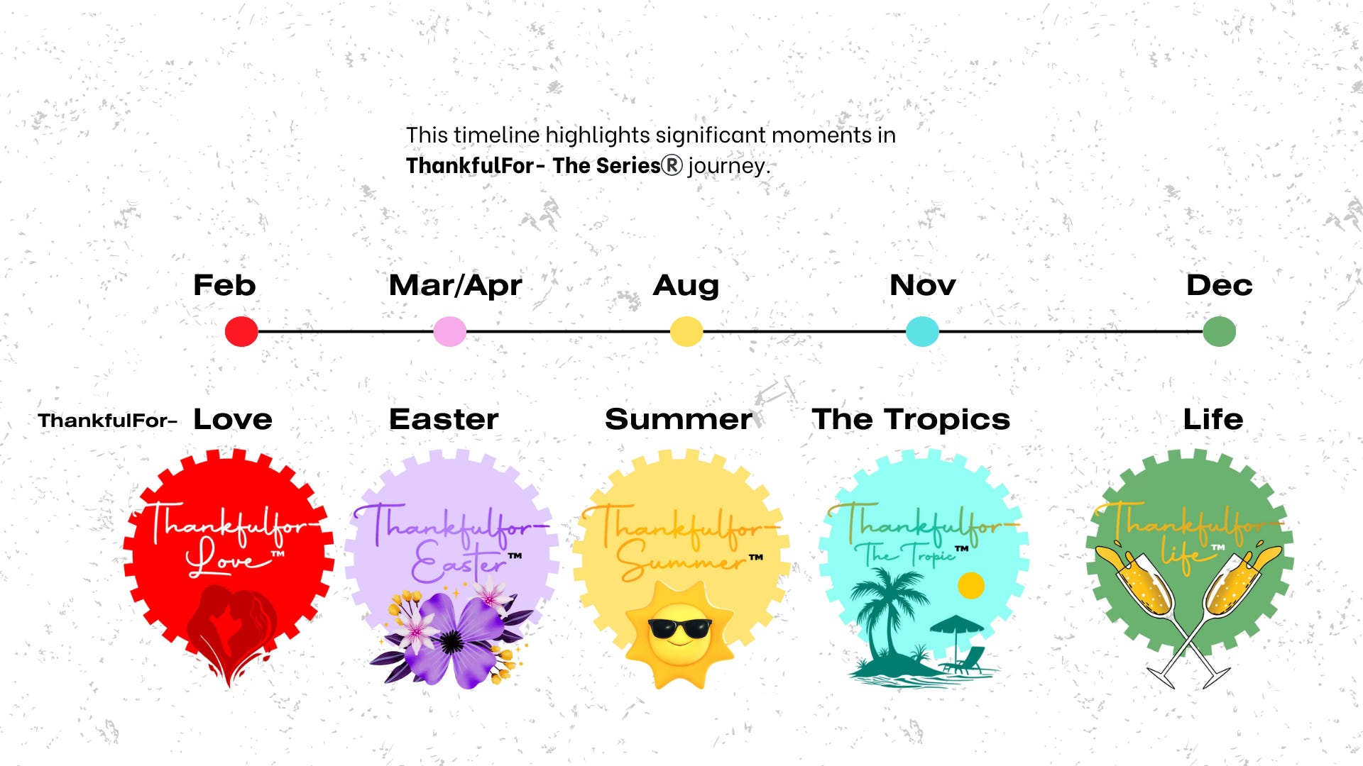
A Deeper Look at the New Logos:
Thankfulfor– Love: Love is an intimate and profound experience, and this logo was designed to reflect that. The deep, passionate red and the silhouette of a couple in a heartfelt embrace capture the romance and deep connection that this event celebrate


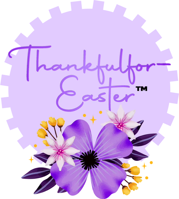
Thankfulfor– Easter: This logo is all about the beauty of renewal and blossoming connections. The soft purple palette and delicate floral illustrations evoke a sense of elegance, growth, and the freshness of the season, perfectly mirroring the spirit of our Easter event
Thankfulfor– Summer: We captured the feeling of pure, sun-drenched joy. The playful, smiling sun with sunglasses embodies the high-energy, carefree vibe of this celebration, set against a warm, optimistic yellow that radiates happiness

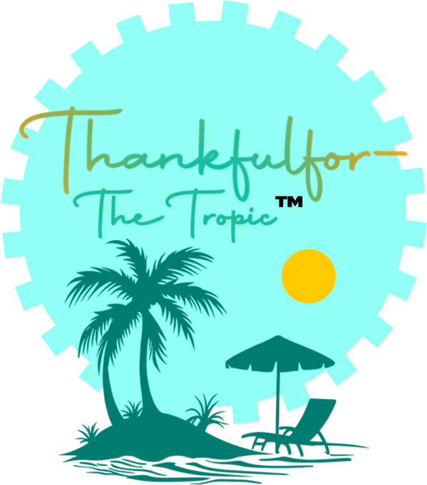
Thankfulfor– The Tropics: This design is an instant escape. The cool turquoise, the silhouette of a palm tree, and the warm sun create a sense of oasis and vibrant relaxation. It’s an invitation to unwind and celebrate in paradise


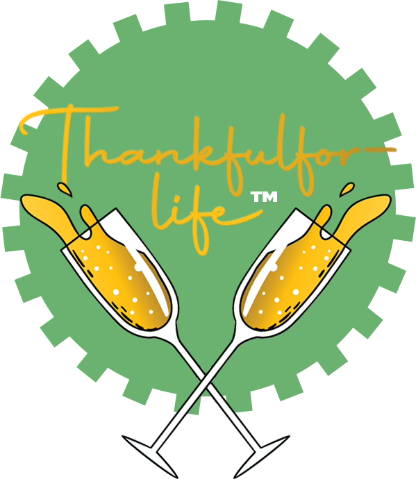
Thankfulfor– life: Our flagship event is, and always will be, the soul of the series. The new logo is a direct reflection of its essence. The two clinking champagne flutes capture the ultimate act of celebration, gratitude, and success. The vibrant green background symbolises life, prosperity, and renewal, while the effervescent gold speaks to the premium, luxurious experience that awaits. It’s a toast to the journey, the community, and the beauty of life itself

Our Unchanging Promise
While our look has evolved, our core values remain unshakable. We are, and always will be:
Community Driven: You are the reason we exist. Our events are built to make you feel welcomed, connected, and inspired.
Masters of Premium Thematic Execution: No two events feel the same because we are committed to meticulous, immersive storytelling and world-class entertainment.
A Source of Cultural Impact: We are building a new tradition in event culture—where people don’t just party, they celebrate life, experiences, and connections.
This new identity is the visual anchor for our future. As we prepare for TFL5: Reliving The 1960's and our expansion across the globe, we are more committed than ever to creating unforgettable memories with you.
Thank you for being part of our story. The best is yet to come.
🔱